Challenge
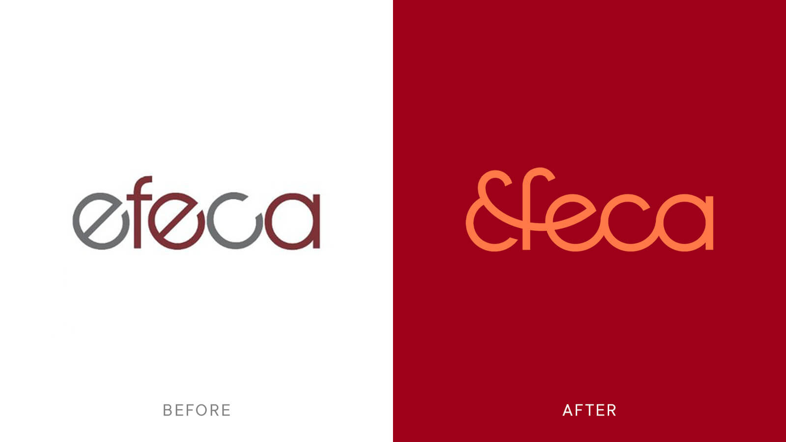
Efeca provide advice and support to develop, implement, monitor, evaluate and report on national and international policies, regulations and private sector commitments, both voluntary and mandatory, on the sustainable and legal sourcing of natural resources, with a focus on agricultural and forest commodities. Celebrating 15 years this year felt like the right opportunity to modernise and add depth to their existing identity.
Strategy
Working in sustainability is complex, particularly for Efeca who navigate the complexity of national and international policies, regulations and private sector commitments. Our strategy simplified Efeca’s offering into a simplified brand idea, "Tackling complexity, delivering clarity".

One of our first conversations with Efeca circled around one of their key criteria for the project – "don't touch the logo". What followed were a series of conversations and workshops that focused on tightening up the strategic positioning and project goals. It soon became clear that in order to achieve the scale of change that was desired, we needed to start from the beginning. So, we touched the logo. And a lot more.


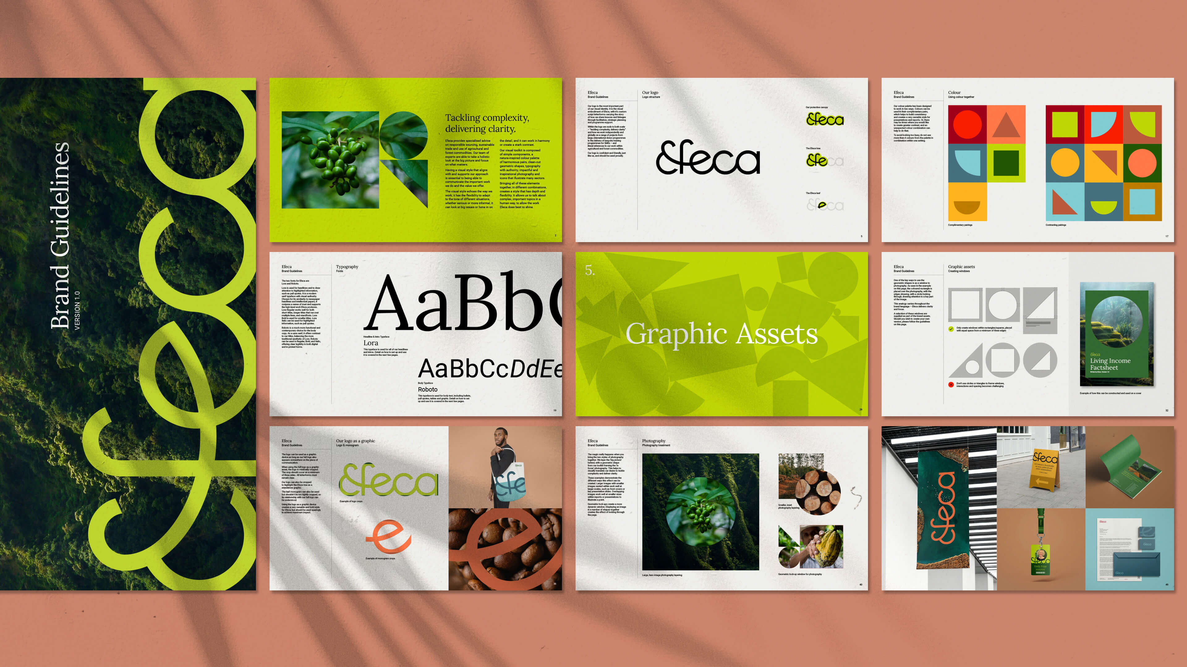
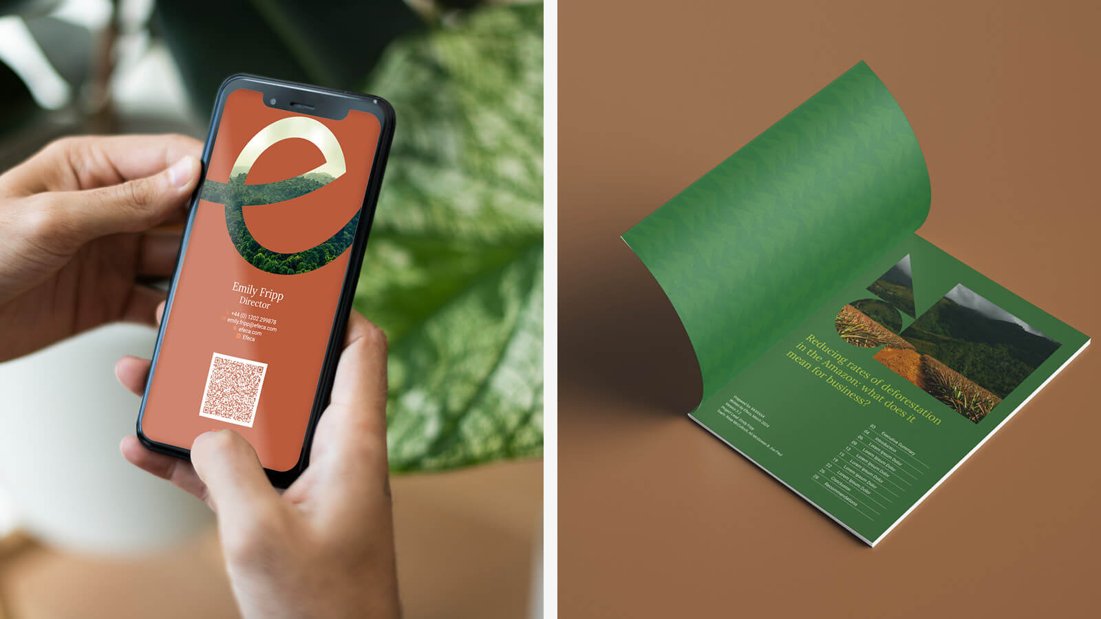
The long term goals of Efeca were to take charge of the brand in-house, so it was important to create an identity toolkit with lots of flexibility and one that could be easily implemented consistently. The toolkit uses a combination of simpler assets, to work together to create a more refined visual language.


Shapes, colour and typography all lean into the juxtaposition of "Tackling complexity, delivering clarity", creating contrast through distance, framing devices, and an editorial approach to headlines coupled with a more relaxed approach to larger blocks of written content.

“Exciting, inspiring, sometimes a little scary, but definitely something we should have done a long time ago. We are delighted with the end results and can’t wait to show the world the new Efeca brand.”
Lucy Cullinane, Operations Director