Challenge
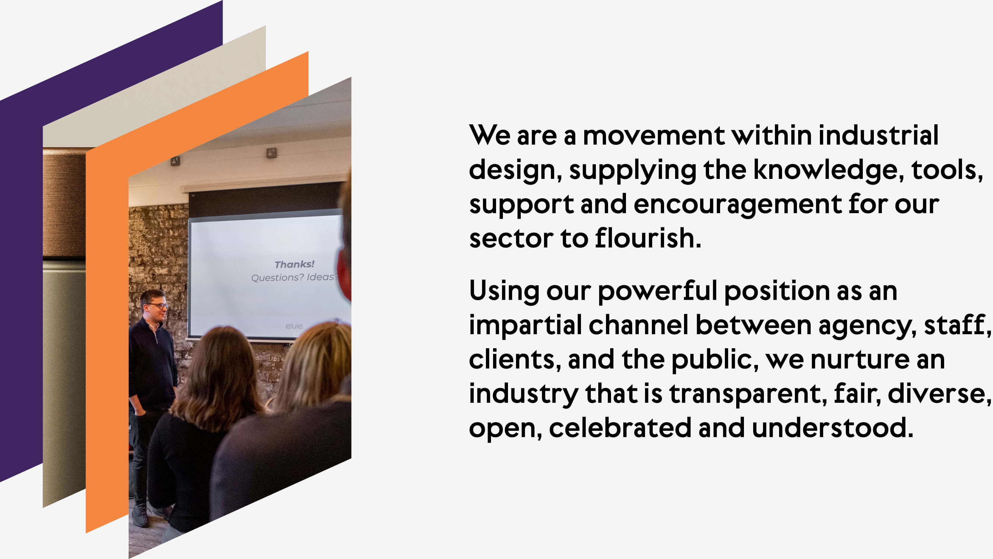
We were approached by Design Truth to review their visual identity, adding depth and distilling their story into one that resonated with their desire to leave a postive impact on industrial design, from fair representation of gender to an industry-wide pledge to pay interns fairly.
Strategy
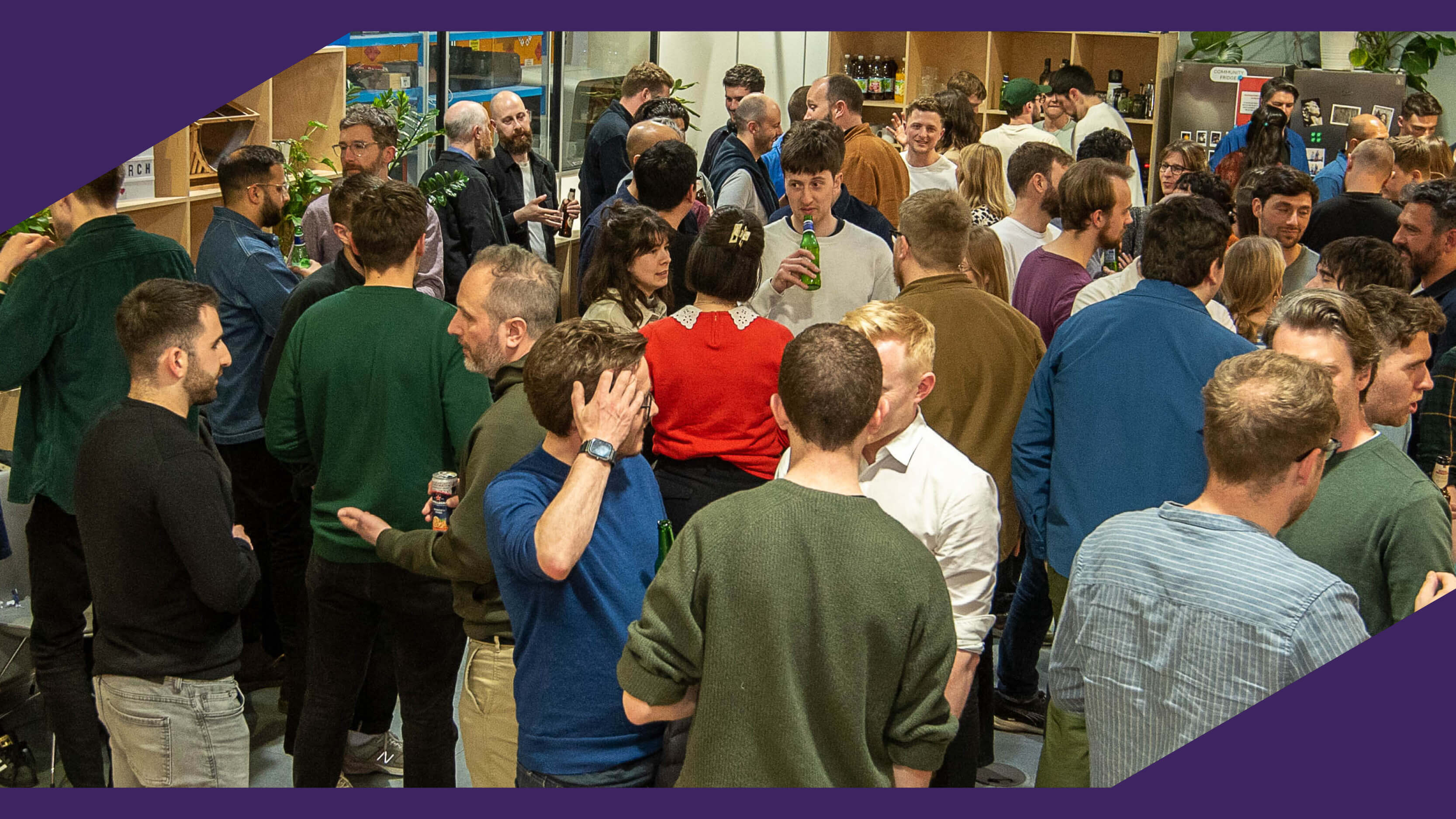
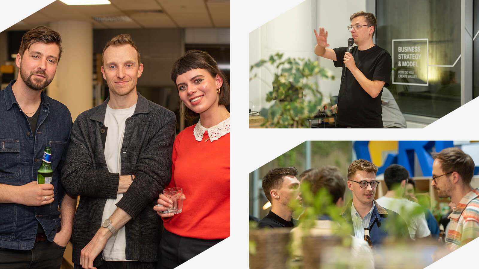
Bridging the gap between industry and community, and finding language and a story that unites these two areas was a key starting point. Engaging members was critical to creating a galvanized audience, aligned with the Design Truth vision, so finding ways to reflect the Design Truth and Industrial Design community was central to the new look and feel.
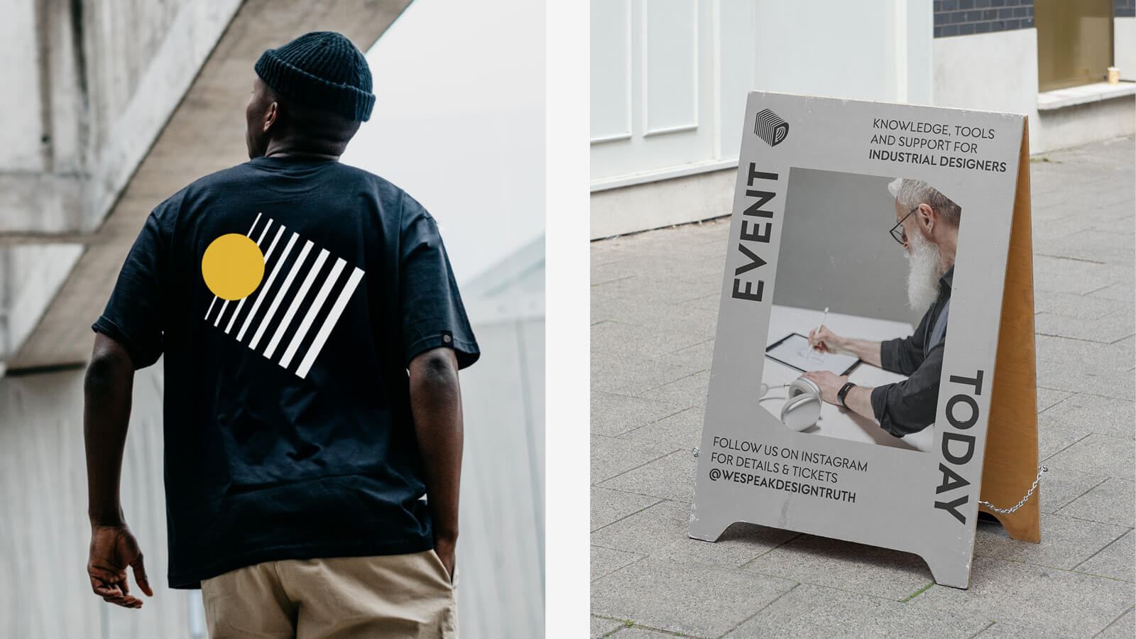
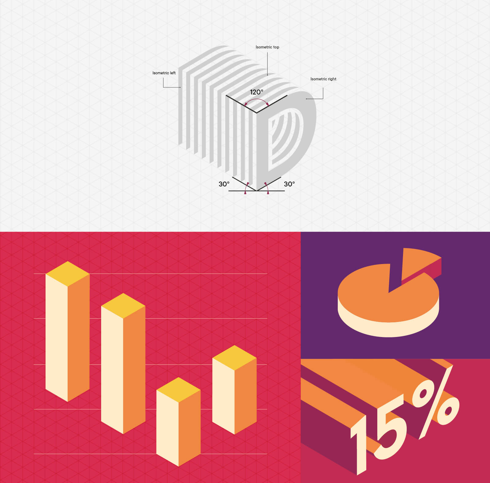
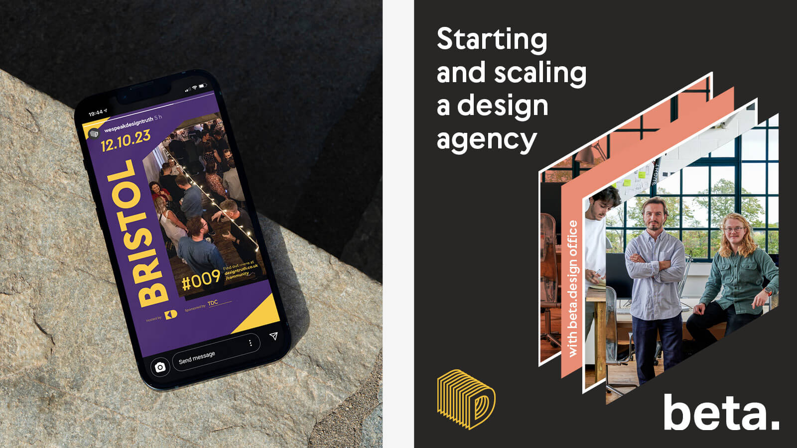
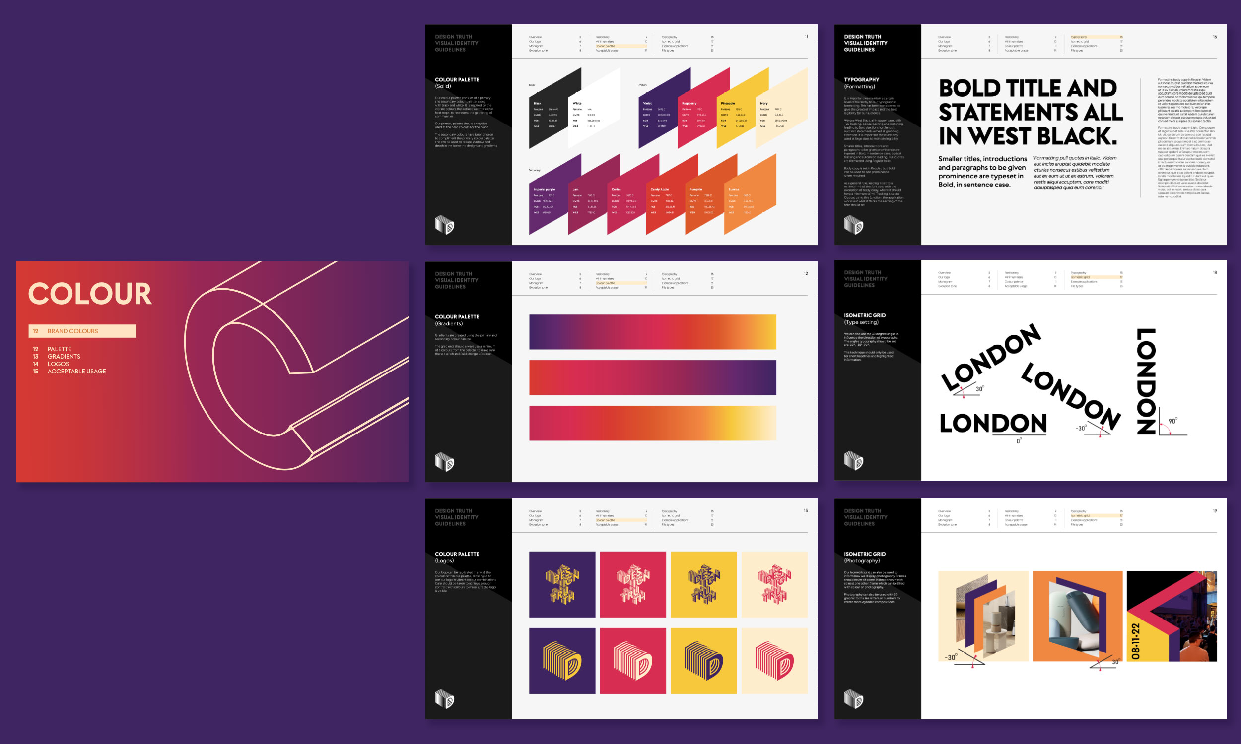
The identity focuses on people, power in numbers and change. The embodiment of (a) movement. Using direction and momentum to create positive change, with nods to three dimensional space by using an isometric grid to create the logo.
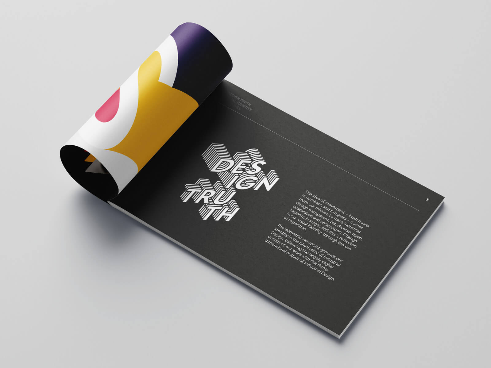
The identity focuses on people (the make-up of a community), and progress through power in numbers – the embodiment of (a) movement. The identity uses direction and momentum to visualise change, with nods to three dimensional space using an isometric grid.
“Working with Pretty Clever on the Design Truth rebrand was an obvious choice. Ethically focused and socially conscious, the combination of highlevel output and a heart in the right place is something we try to seek from any clients or supplier”
Brad – Founder, Design Truth