Challenge:
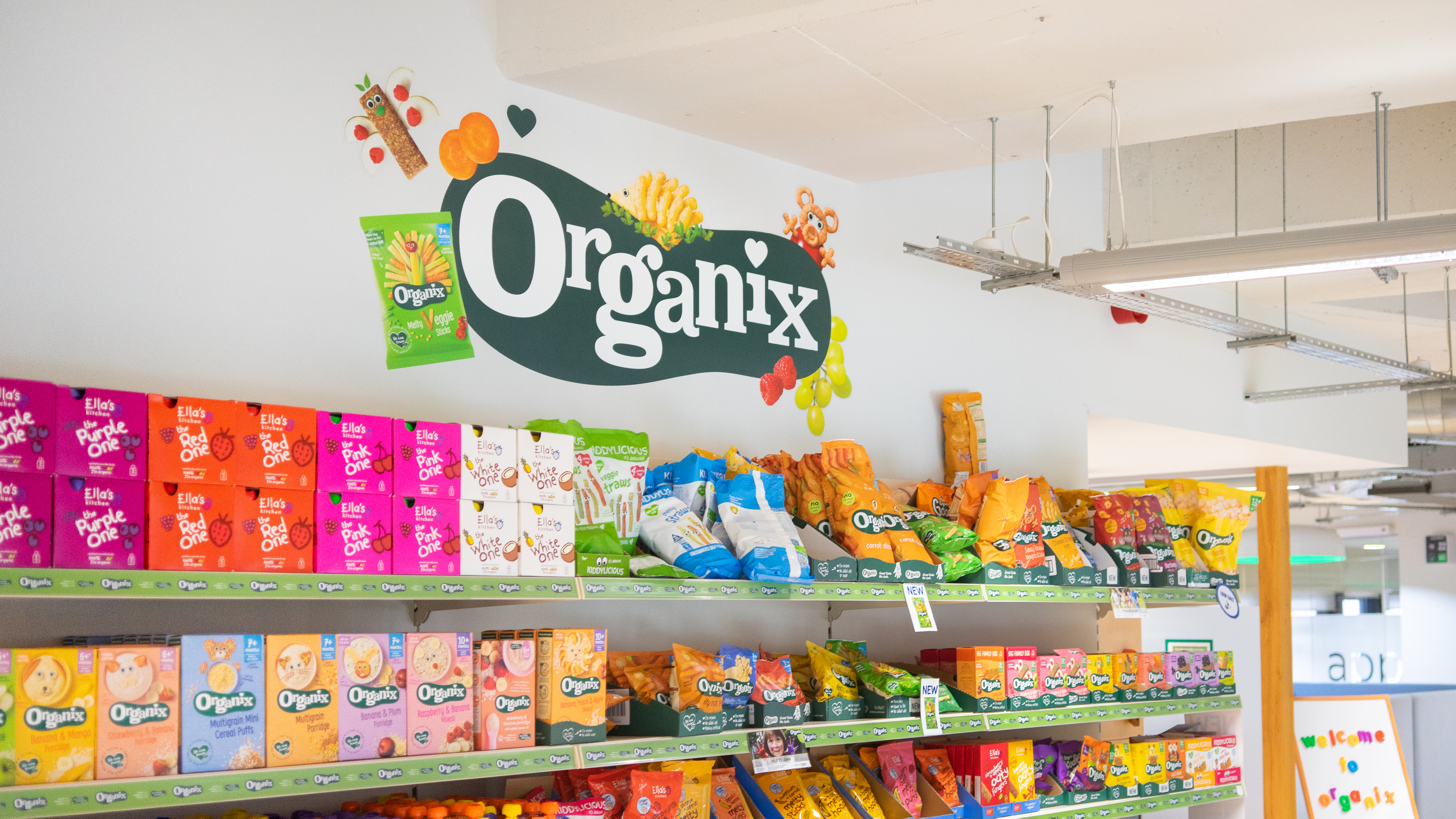
When you think of the UK's leading baby finger foods and toddler snacks there's one company that comes to mind. Organix have been cooking up scrummy, nutritious baby and toddler meals and snacks since 1992. They had recently gone through an award-winning pack re-design (Roman Klis) and brand positioning work (The Gate London) and invited us in to chat about translating these changes into their work environment.
Strategy:
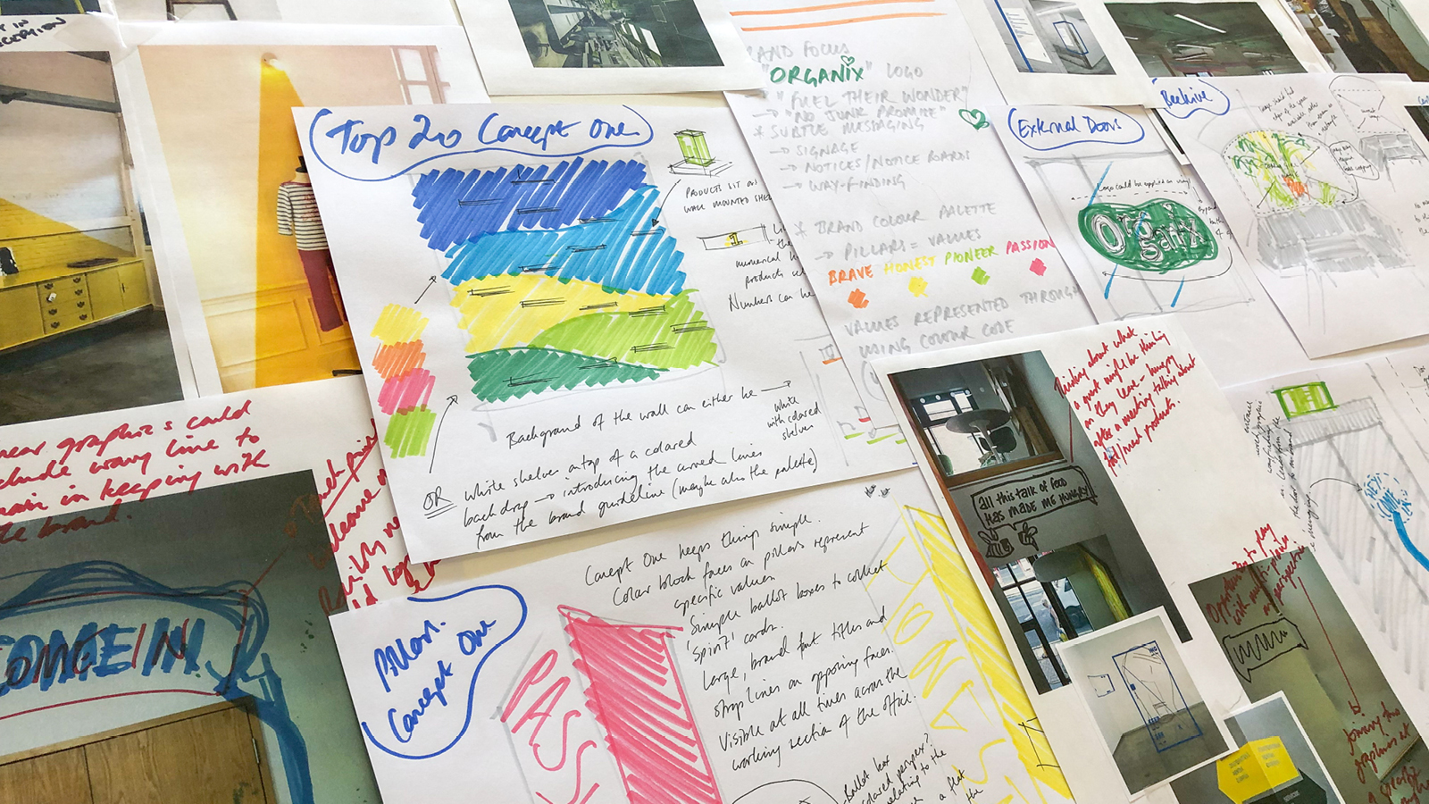
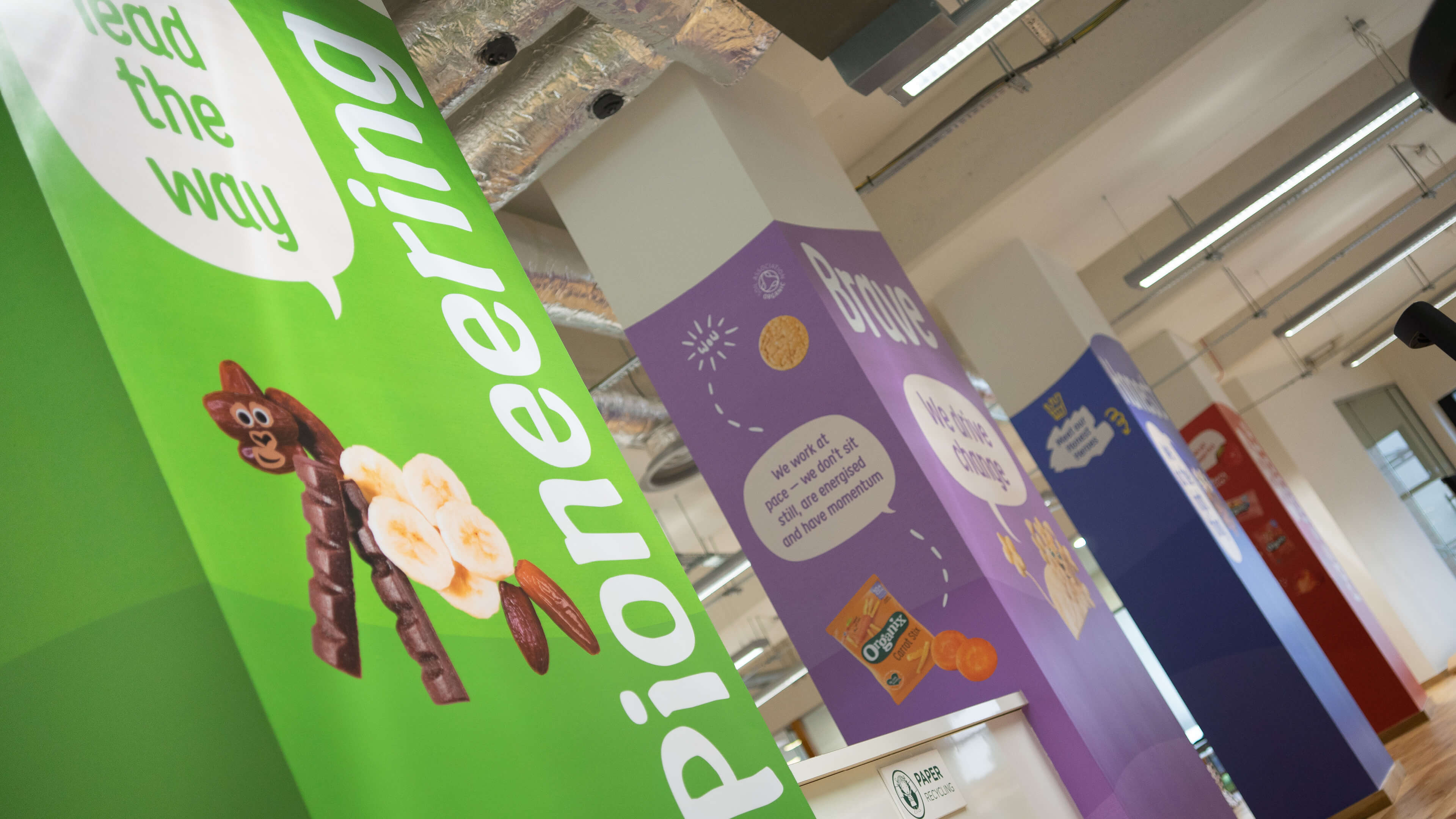
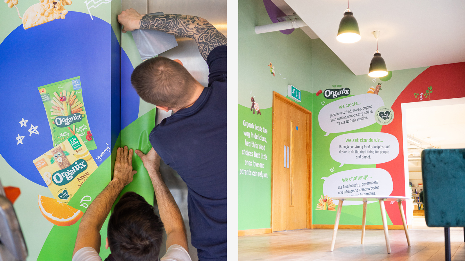
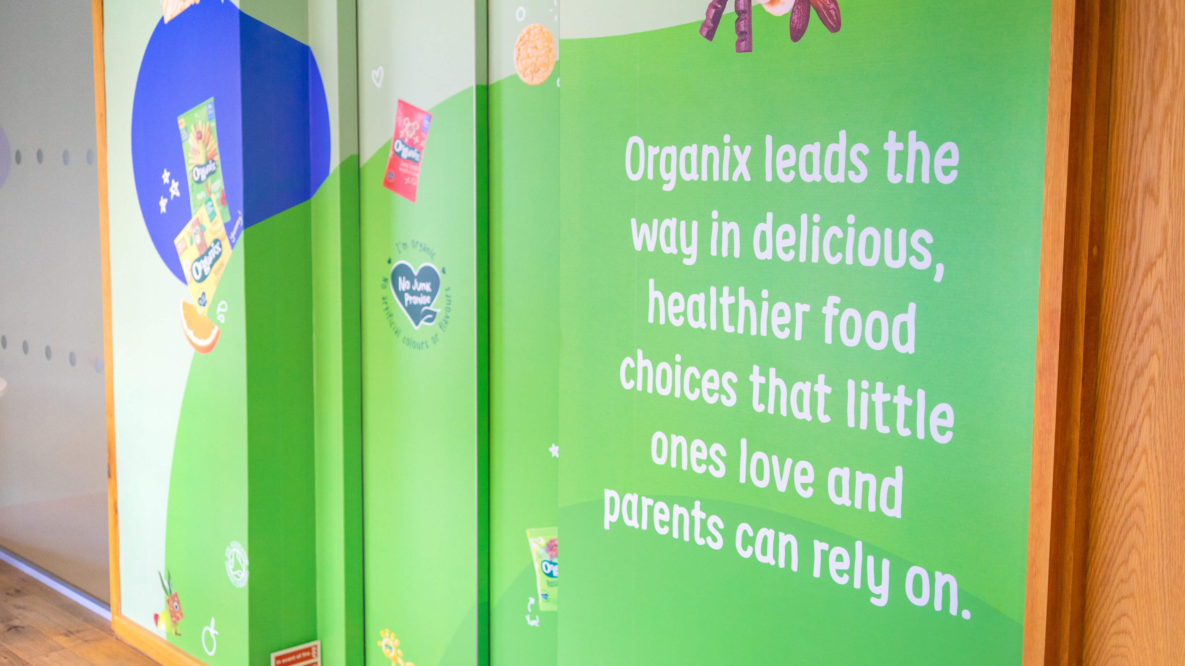
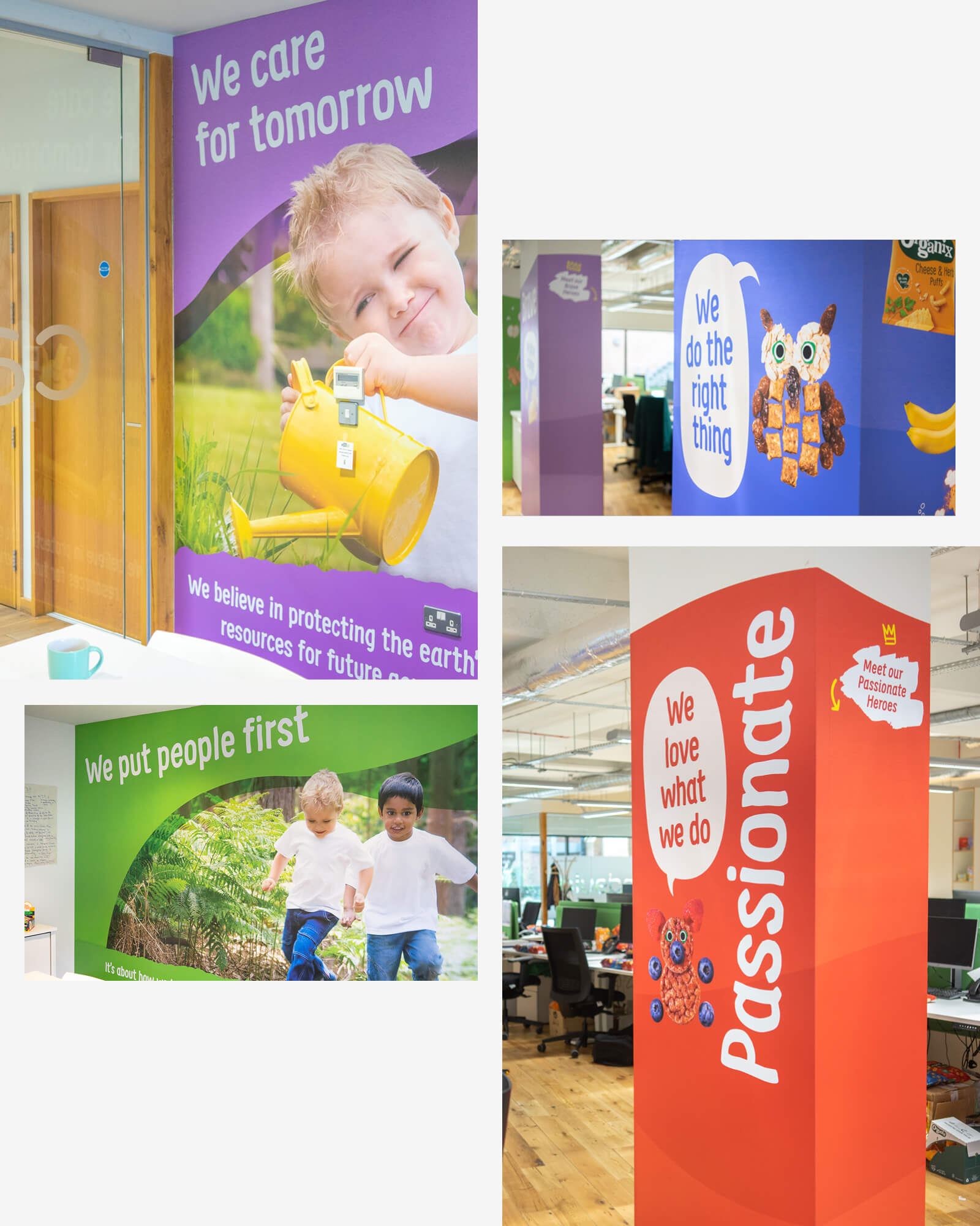
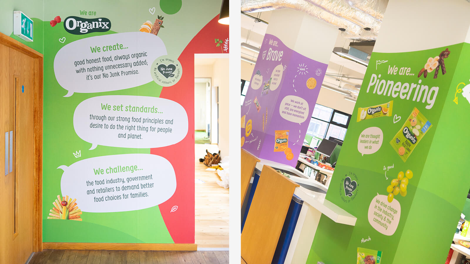
We noted the packaging and positioning work both had a distinct aesthetic, but the two hadn't been used together yet as part of a broader visual language. We needed to create a look and feel that captured both bodies of existing work while making them feel like one cohesive approach. We identified an opportunity to go further and be less prescriptive with the space, adding value beyond brand reinforcement. We identified they have two key audience members – employees and customers – both with differing needs that should be reflected in the finished work. As part of our research, we were able to analyse and develop specific messaging to targeted groups, analyse the footfall and flow of the building and identify how we weight the messaging depending on how each space was likely to be used.
Wayfinding:
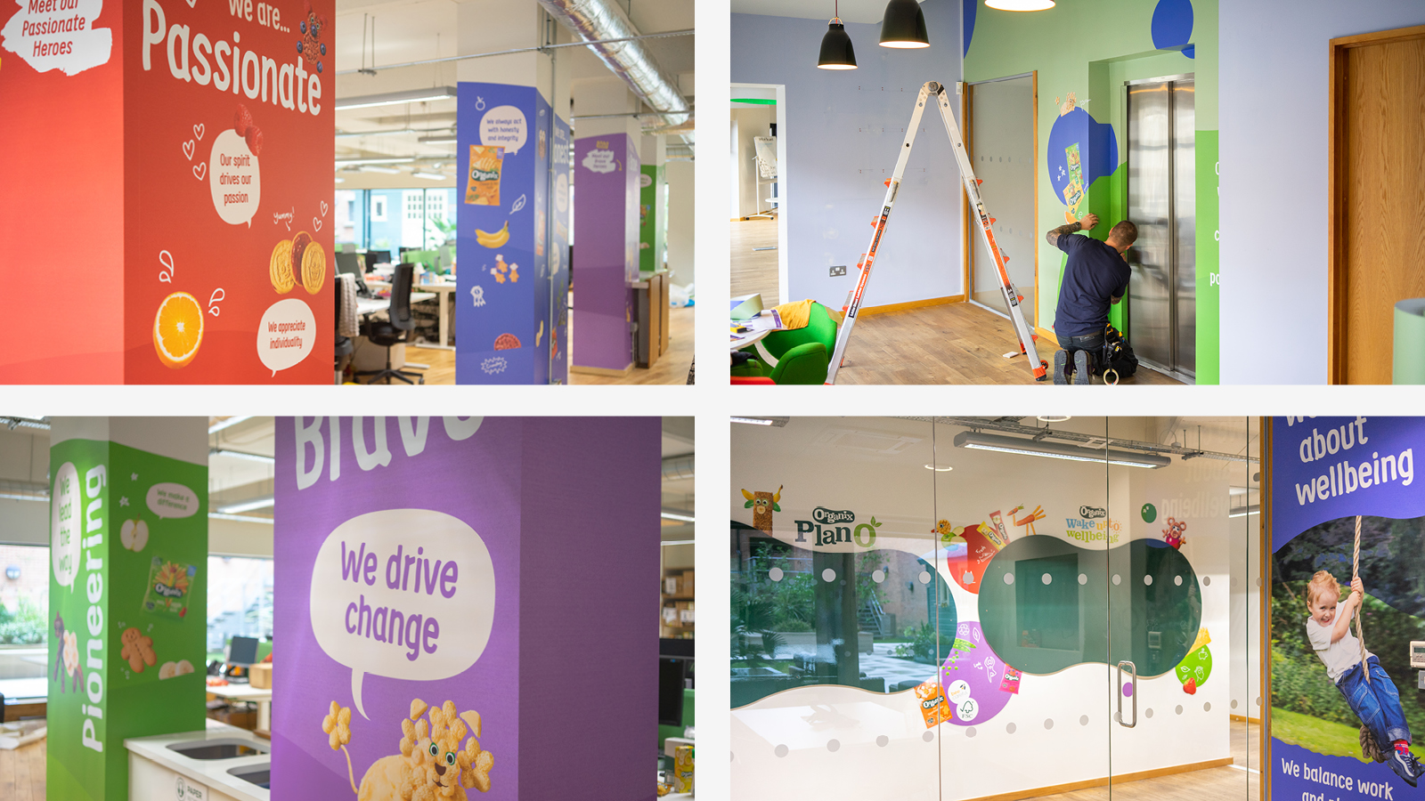
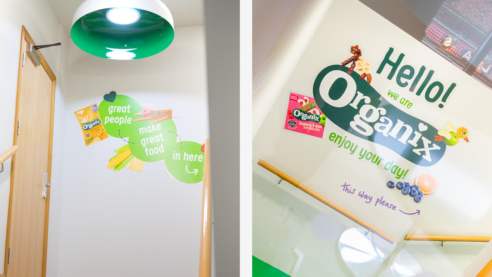
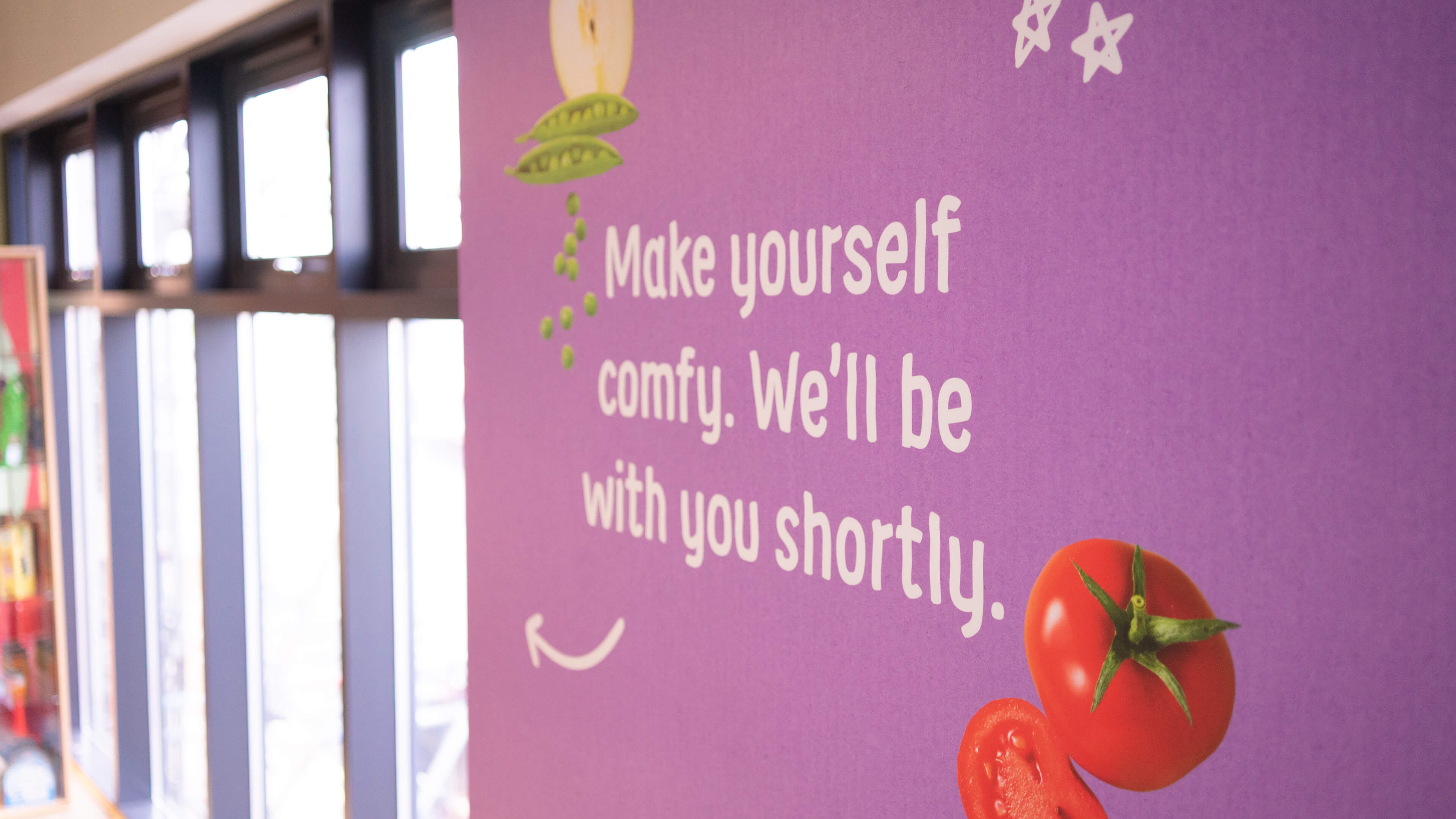
As a visitor ourselves, we identified an opportunity to add some simple wayfinding into the space, to add clarity to your behaviour as a visitor. This was most apparent in the reception area, which presented the opportunity to give clear wayfinding, instruction and company insight.
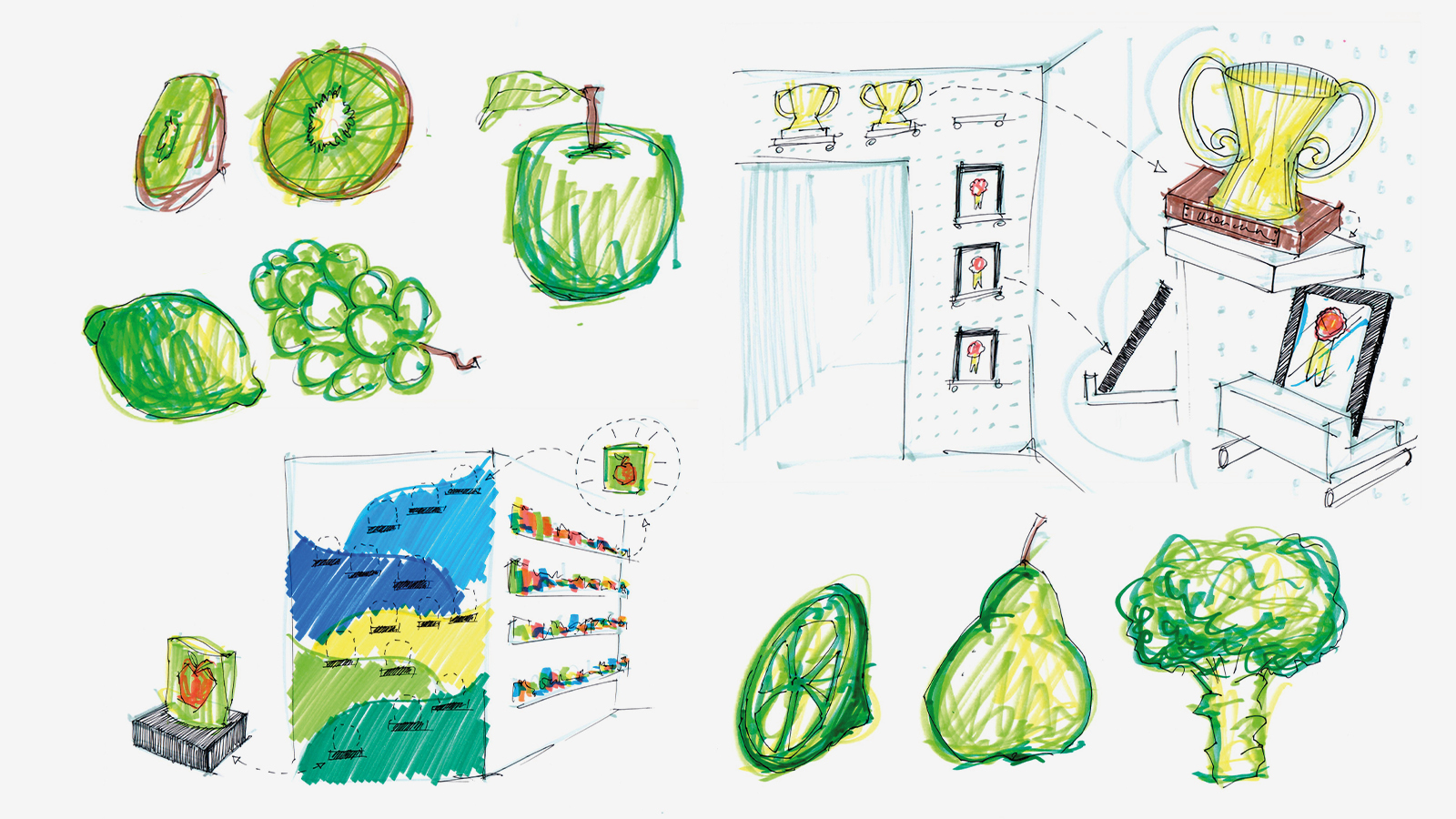
It's ok to play
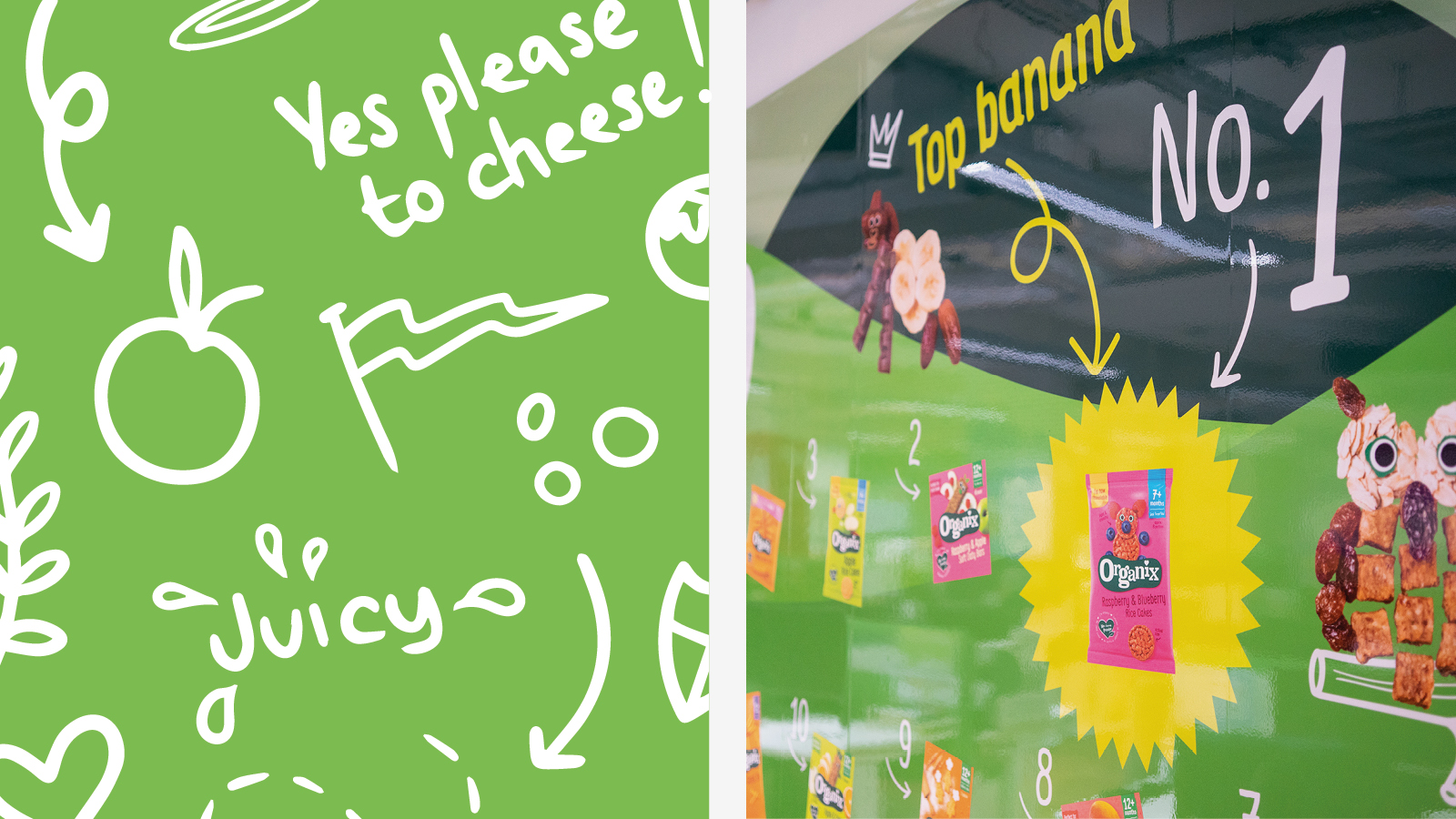
Scale is something we experimented with during the design process in an attempt to make visitors and staff feel physically smaller, more like a child, so we could encourage positive behaviours that relate to being a child. Specifically, children are encouraged to play much more than adults and by making people feel physically smaller we wanted to see if we could encourage fun, playfulness and a loss of inhibitions, therefore giving greater freedom for innovation. We achieved this through over-sized graphics, magnetic multi-use spaces, and the introduction of hand drawn illustration elements.