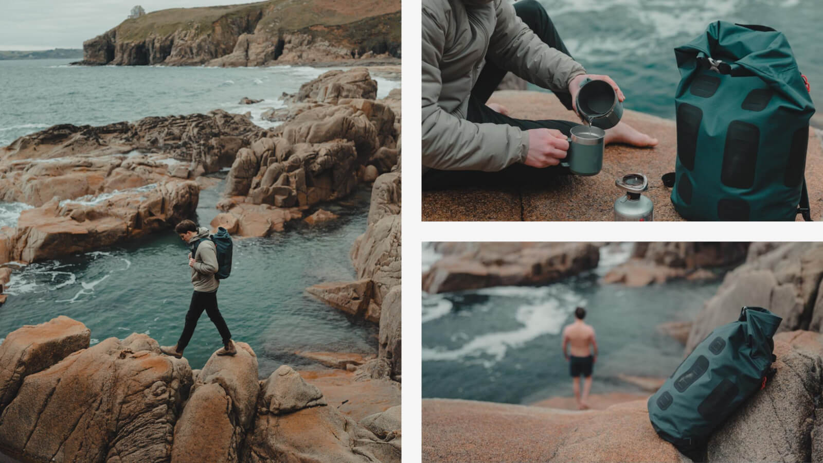
Challenge:
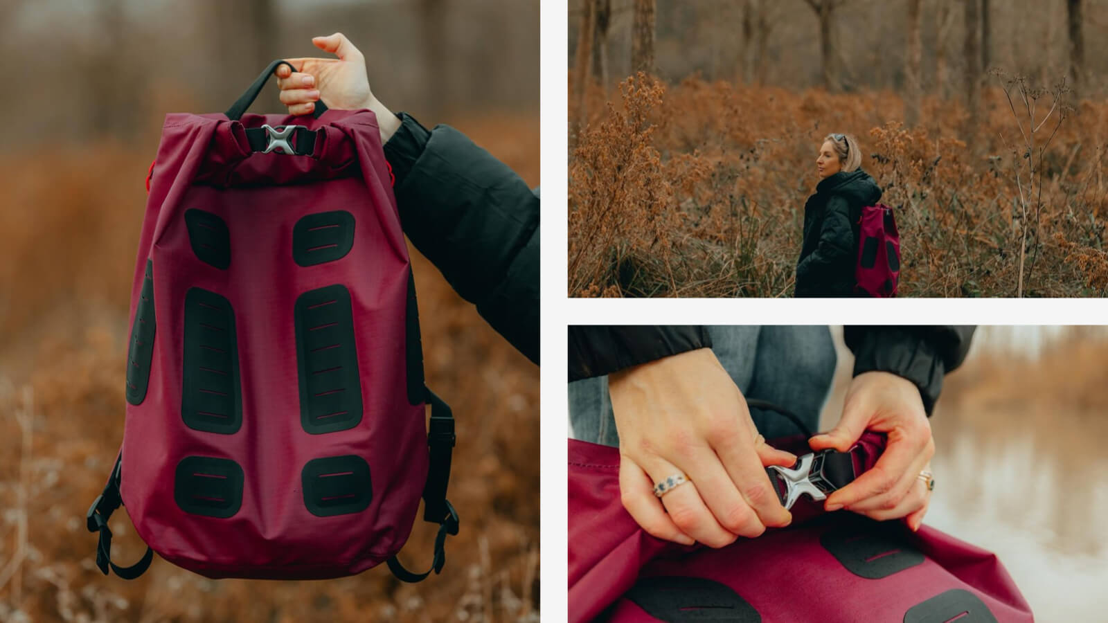
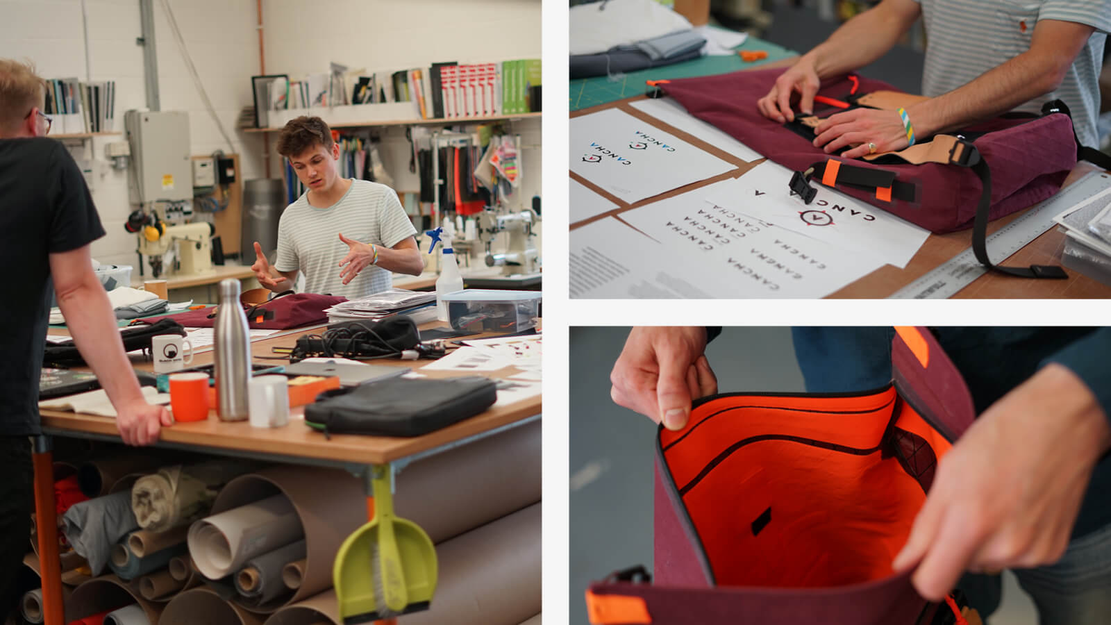
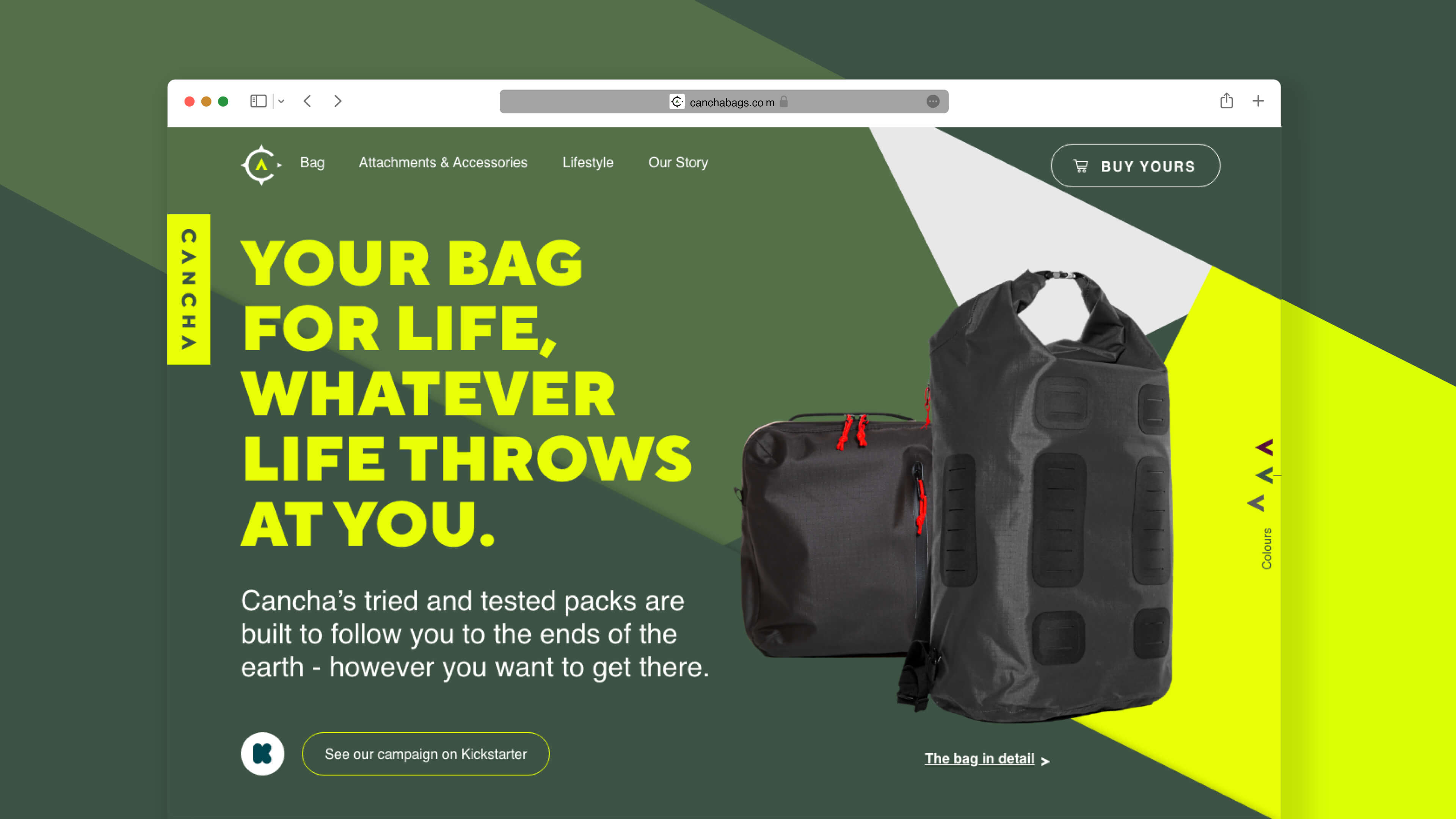
Cancha was founded by professional tennis player, Jack Oswald. Jack wanted to design an adaptable pack that could hold his racquets and that last minute pair of tennis shoes, but soon began to envision a product that would go beyond his own needs. A bag that would be compact enough for a day touring around a new city, but could expand to accommodate a week of road-tripping. One that was rugged enough to withstand being thrown around a luggage carousel a million times or join a thrill seeker on a mountain peak.
Strategy:
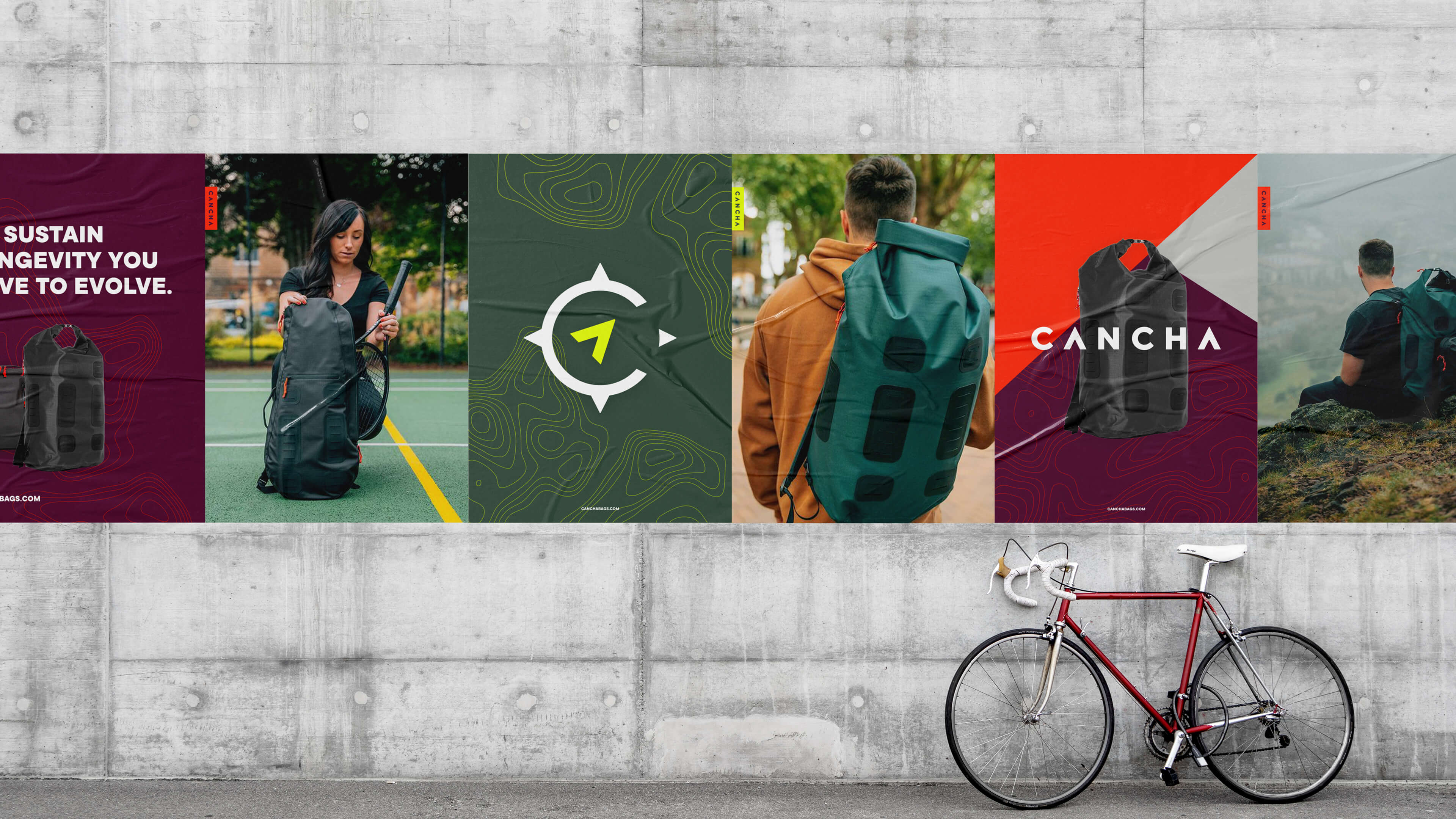
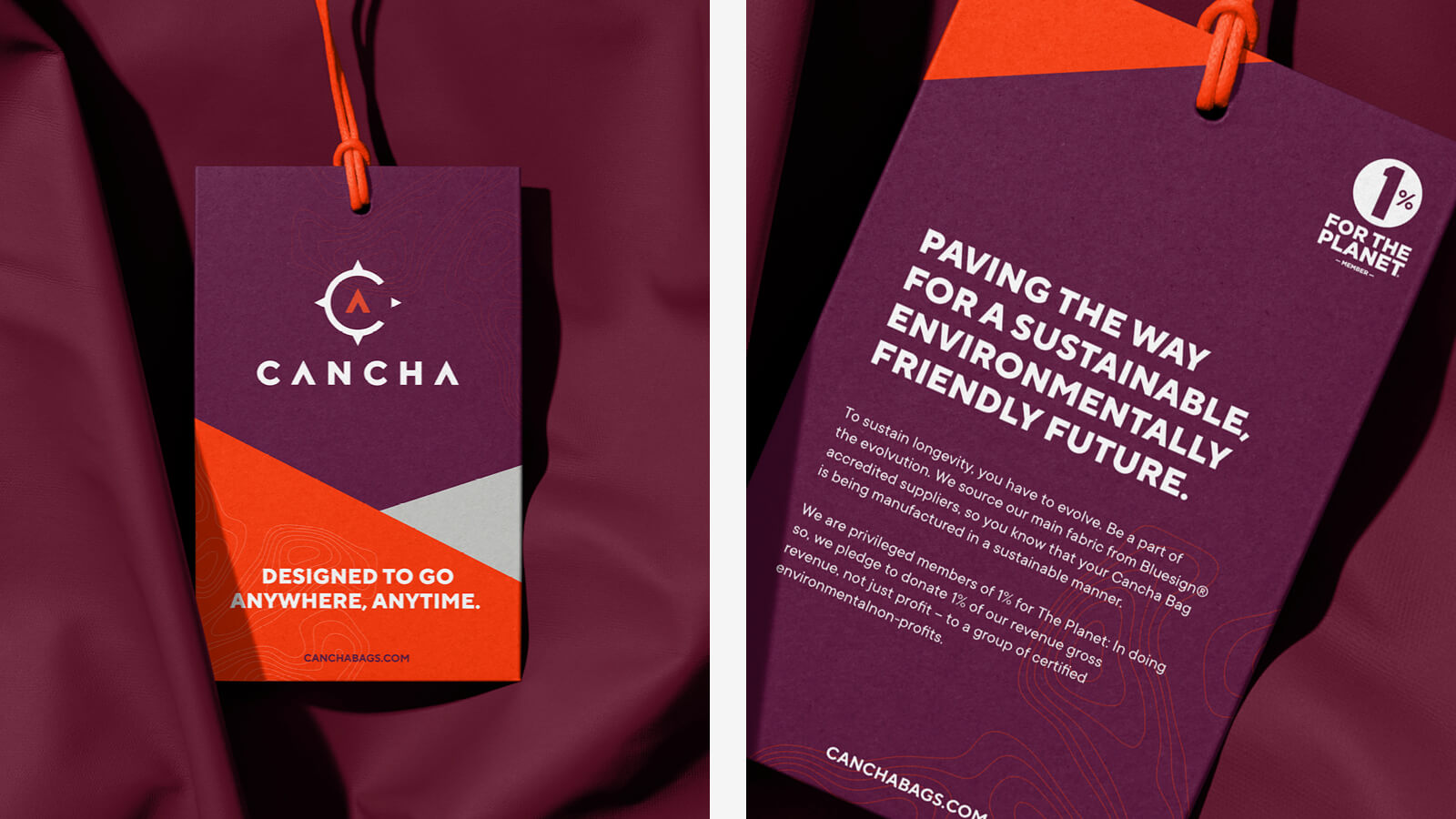
Always at the fore of our conversations was Cancha's desire to create a bag that lasted, while serving multiple purposes, therefore reducing the need for consumption on two fronts. The focus was on making practicality exciting – making the journey as epic as the destination – reflecting the day-to-day requirements of a bag, while highlighting the diversity of a bag ready to take on any adventure.
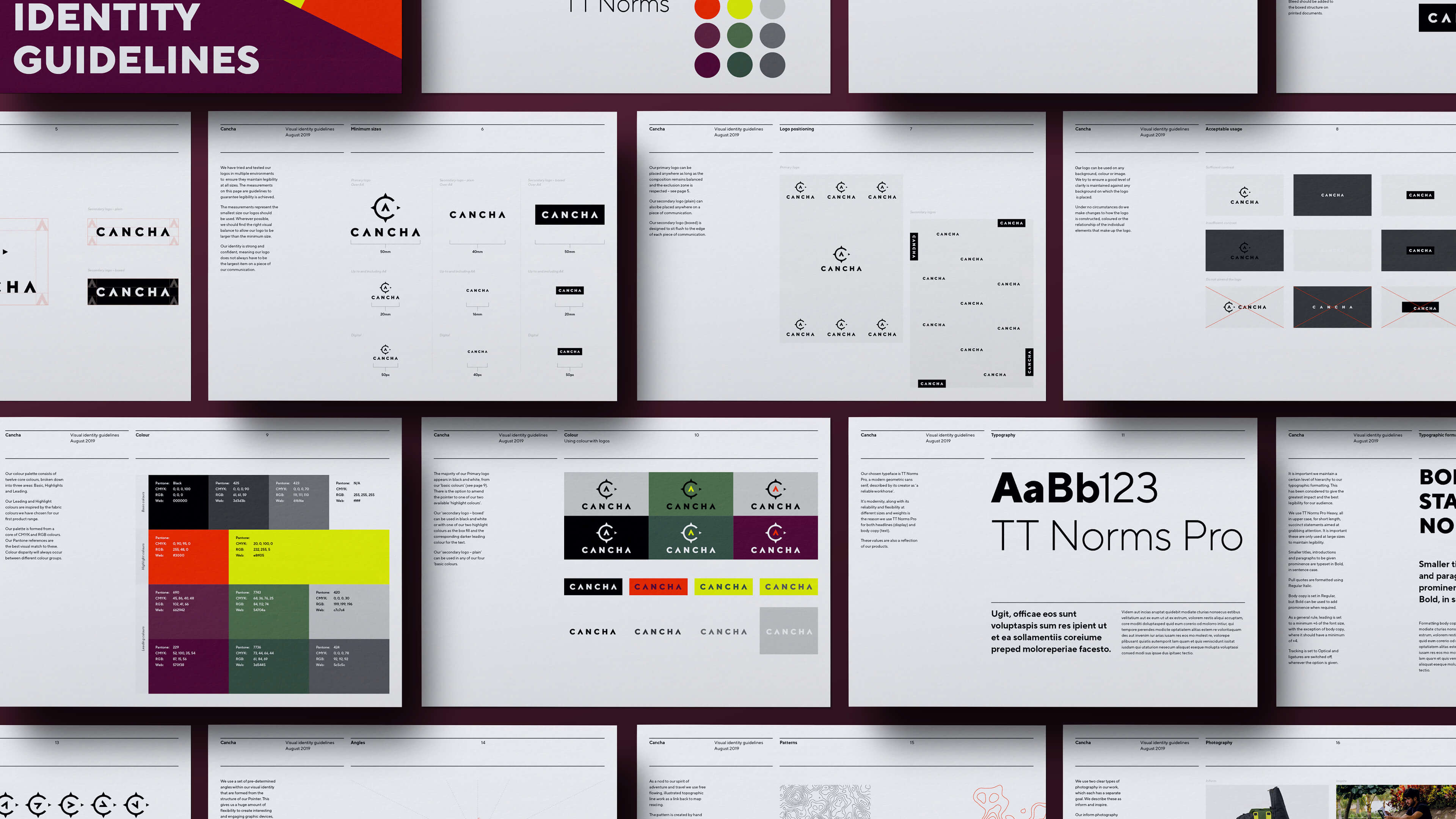
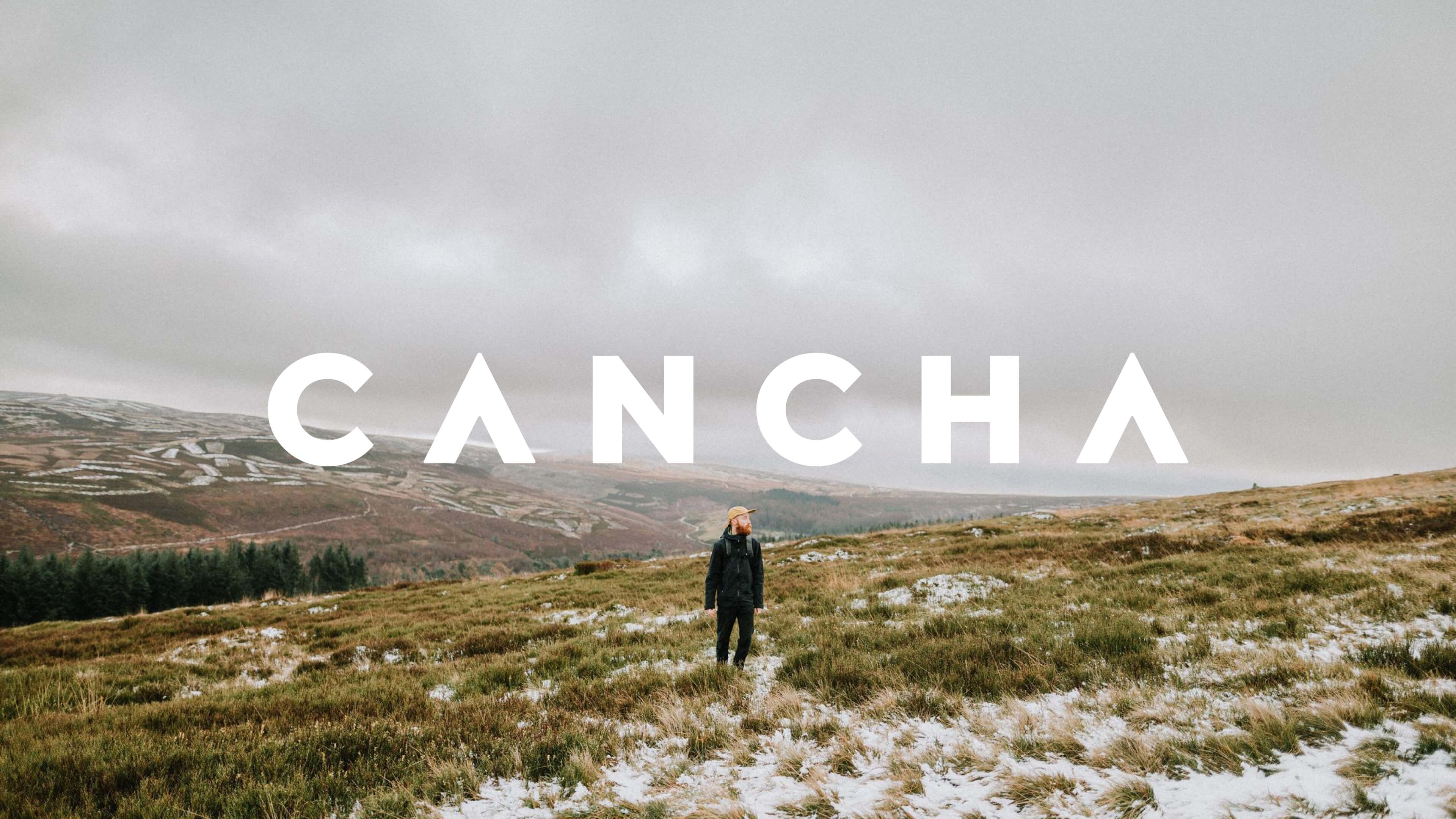
Identity development
Cancha approached us with an existing logo, but no wider visual identity or assets. We were asked to re-visit the logo and see how we might translate that into a wider visual identity, which could be integrated into the product and inform the look and feel of printed and digital brand assets.
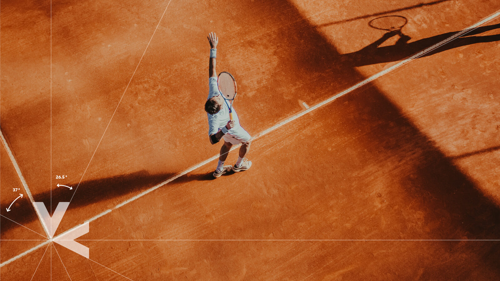
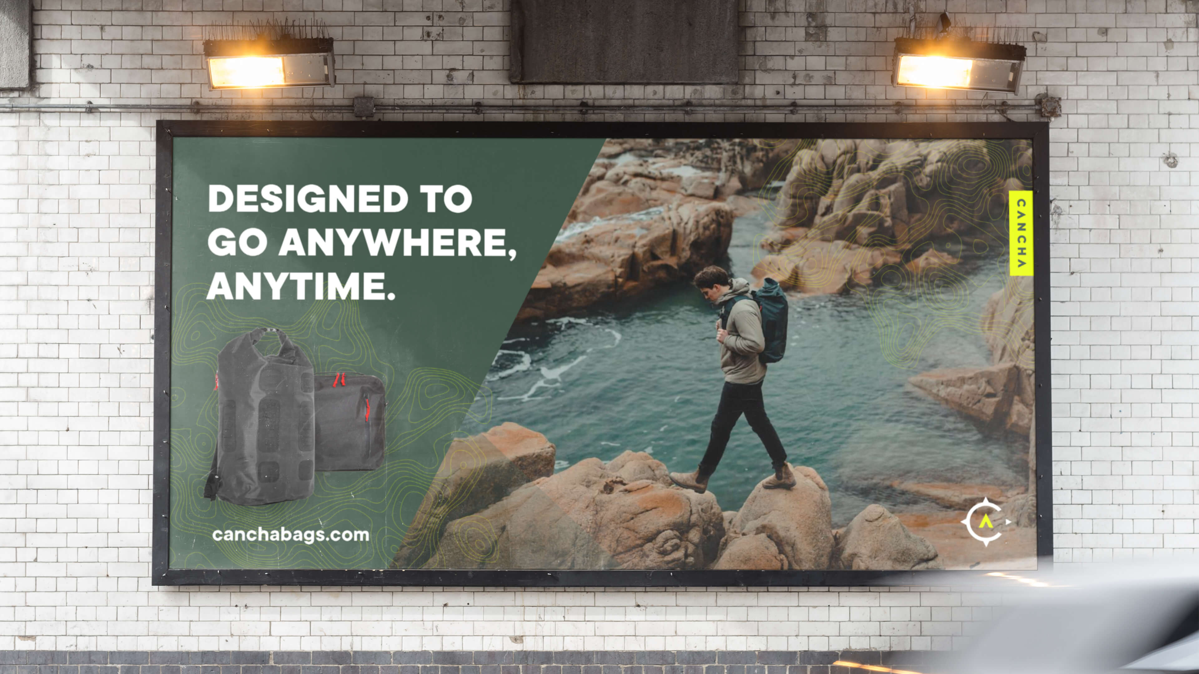
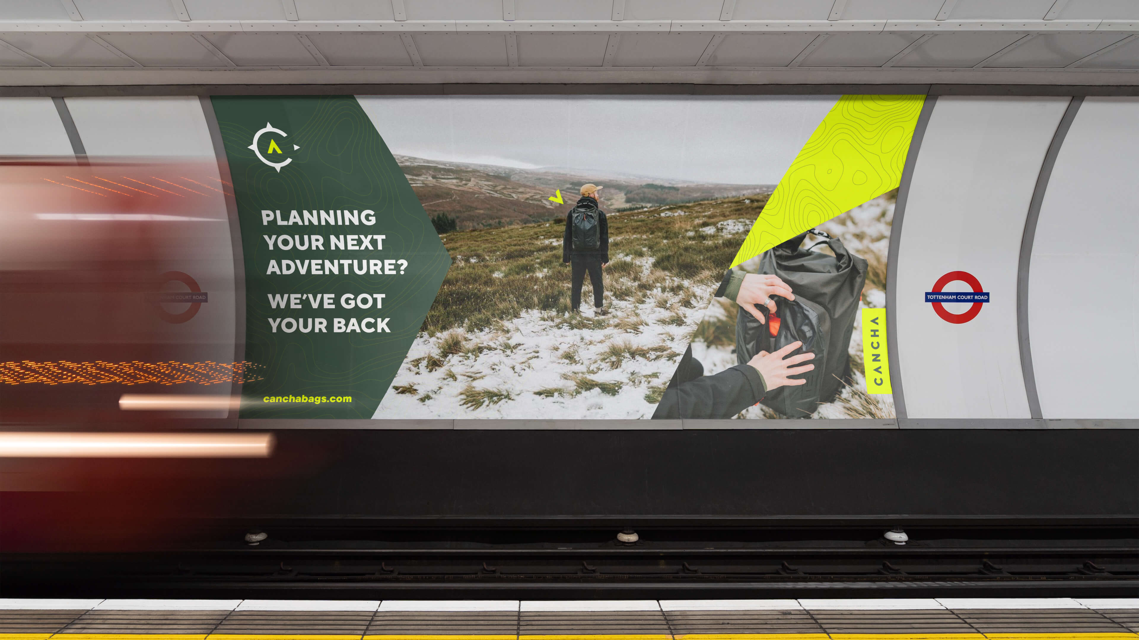
A visual language based on direction and travel
We developed a visual language inspired by movement, direction and travel, framed with directional arrows, topographic patterns and compass references. The compass pointer created a number of ownable angles that could be used to house colour, type and imagery.